Day 12: Understanding ARIA for accessibility
The formal name for ARIA is 'Web Accessibility Initiative- Accessible Rich Internet Applications (WAI-ARIA). It is a technical specification developed and published by the World Wide Web Consortium (W3C) who develop web standards worldwide. ARIA helps make complex web components, like menus and forms, more accessible for everyone, including users of assistive technologies like screen readers.
Why ARIA matters and what it does
ARIA provides additional information to assistive technologies, explaining how custom elements or complex web components function. It acts as a bridge between these components and assistive technologies by providing additional information about how these elements function. It works by:
- providing extra information: ARIA gives details about how custom elements function, making them more understandable to assistive technology, like screen readers.
- improving accessibility: it helps users interact with dynamic or complex components that standard HTML cannot describe and it can also help annouce dynamic content updates like errors or notifications.
- supporting navigation: ARIA can make navigation smoother by grouping related elements or labelling interactive parts, which can enhance navigation for keyboard users.
When to use ARIA
Use ARIA only when absolutely necessary. Standard HTML elements like <button>, <a>, and <input> are accessible and should be your first choice. ARIA should only be used to supplement, for example to:
- label or "describe elements with
"aria-label"or"aria-describedby" - inform users of element states with
"aria-expanded","aria-selected", or"aria-hidden" - group related elements using
"role"attributes, such asrole="tablist"orrole="dialog"
Best practices for ARIA
ARIA can be easy to implement incorrectly, which can result in disabled people being unable to use your website or service. You must follow the ARIA Authoring Practices Guide from W3C, which includes the following best practices (not exhaustive):
- don’t use ARIA to fix non-semantic HTML elements; always use correct HTML tags first
- test ARIA attributes with screen readers to ensure they work as expected
- keep ARIA roles and properties simple and relevant to the interaction
- add interaction-specific ARIA attributes such as aria-controls using JavaScript, but ensure the core functionality still works for users without JavaScript
- update ARIA attributes when JavaScript changes occur on the page, for example, set aria-expanded to true when a user expands a collapsible element
ARIA roles and their uses
The ARIA Authoring Practices Guide from W3C provide full info on ARIA role uses, the following table shows a few common ARIA roles and their purposes:
| Role | Purpose |
|---|---|
| button | identifies an element as a clickable button, it can be used in combination with the "aria-pressed" or "aria-controls" attributes to create toggle buttons similar to what was used in the chart on day 4. |
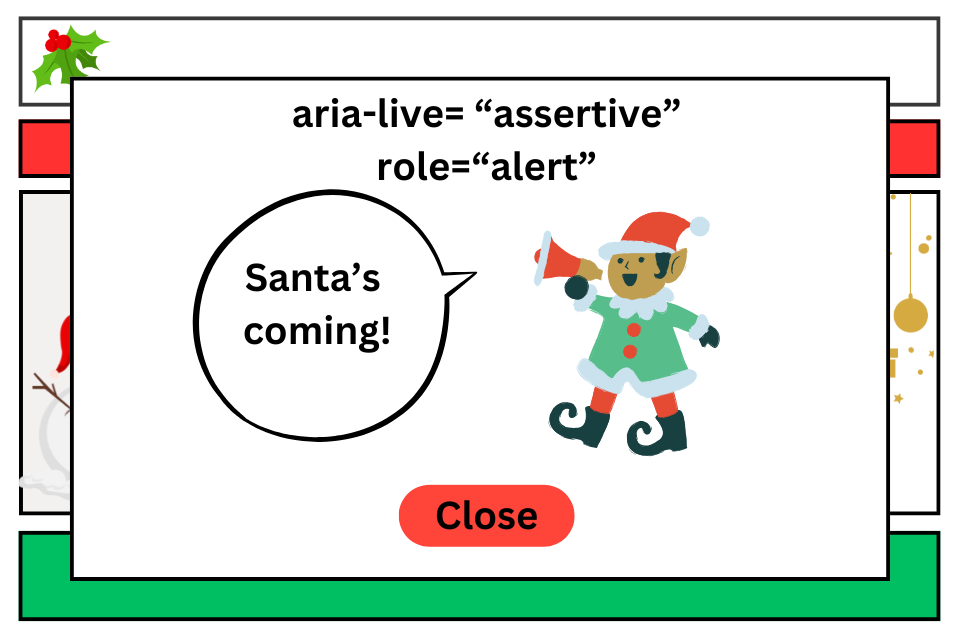
| alert | communicates urgent messages, like error or notification messages, to users. This could also be used with "aria-live="assertive" to ensure the message is read out immediately, overriding other content. |
| dialog | is used for elements like dialog boxes or modal windows, which are often used for pop-up notifications or confirmations. It ensures assistive technologies annouces their precence appropriately to users and occasionaly for things like ensuring keyboard focus remains in the dialog until the user closes it. |

ARIA landmark roles
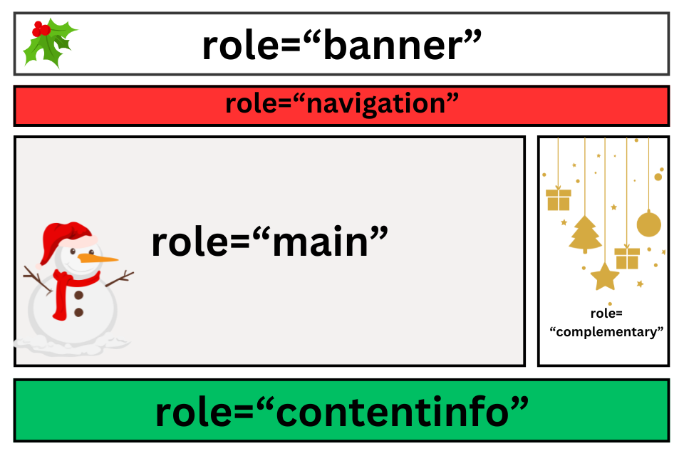
ARIA landmark roles help assistive technology users quickly navigate key sections of a webpage. They define regions like the main content area, navigation, and footers, making it easier for users to find important information.
Common ARIA landmark roles
- main: identifies the primary content of the page. It is recommended to be used only once per page to avoid confusion. This region should contain the central information of the page.
- banner: represents the site’s header, including navigation or introductory content.
- navigation: marks sections containing links used for navigating the website. The use of a skip link, particularly when navigation is long or repeated can also be used so that users can skip straight to other landmark areas such as directly to main content.
- complementary: used for sections that complement the main content, such as sidebars or related content.
- contentinfo: represents the footer area, typically for legal information, copyright details, or contact information.

Best practice: Landmark roles should be used in conjunction with semantic HTML elements such as <header>, <nav>, <main>, and <footer> to ensure a clear structure. This approach supports better accessibility and ensures that assistive technology can provide efficient navigation.
Testing ARIA
It's important to test ARIA to make sure it works as intended. Examples of how to do this include:
- testing with screen readers like NVDA, JAWS, or VoiceOver
- navigating your website using only a keyboard
- checking for ARIA issues with automated accessibility testing tools like axe or WAVE
Introducing ARIA
Watch the video from Chrome for developers introducing ARIA and it's uses