Day 4: Making images and visual content accessible
Its important to make sure all content on websites, apps and digital services is accessible to everyone. This is particularly important when your content contains images or other visuals like charts or graphs.
Images and visual content can enhance your website, but without accessibility, they may exclude users with visual impairments. Today, focuses on two key areas: alt text and data visualisation.
Add alt text to images
Ideally any information contained within an image should be also within the text on a page, however in some cases this is not always possible which is when alt text is used. Alt text (alternative text) is vital for making images accessible. Screen readers use alt text to describe images, helping blind and visually impaired users understand their purpose.

How to write good alt text
- describe the purpose: Explain what the image communicates in its context.
- be concise yet descriptive: Keep it brief but meaningful.
- example: For an image of Santa and his christmas list, use: "Santa Claus reading the naughty and nice list list" rather than just 'Santa' or 'Christmas image'
- avoid redundant content: Don’t start with “image of” or “picture of”—screen readers already convey this.
- mark decorative images properly: If the image is purely decorative, set the alt attribute as alt="" or mark it as decorative.
RNIB video - accessible images
Watch the video from RNIB on accessible images and how important these are for blind and partially sighted people in education.
Best practices for accessible data visualisations
Presenting data in accessible ways ensures everyone can understand your visual content, including people with disabilities.
Choose the right visualisation for the data
Match the visualisation to the type of data you’re presenting.
- use bar charts for comparisons.
- use line charts for trends over time.
- use pie charts sparingly for showing proportions but avoid them if there are too many segments.
Use colour effectively
- avoid relying on colour alone to convey meaning. Instead, pair colours with patterns, textures, or labels.
- ensure sufficient contrast between colours. Tools like WebAIM’s Colour Contrast Checker can help.
- use a colour-blind-friendly palette, such as tools provided by ColorBrewer.
Provide text alternatives
Describe the visualisation in words:
- summarise key takeaways in a caption or adjacent text.
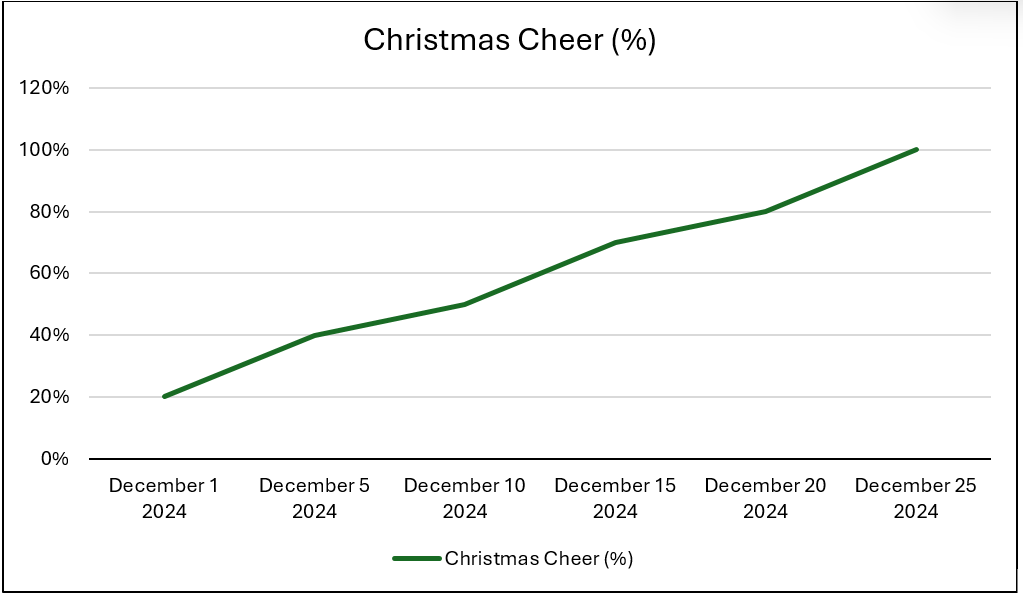
- add alt text that explains the purpose of the chart (for example, “A line chart showing how Christmas cheer increases from 1 December (20%) and peaks at 90% on 25 December.”).
Add data tables
Include the raw data in a simple, well-structured table below the visualisation, or add a toggle button which allows users to view this. This ensures users who can’t interpret the chart can still access the data.
Label clearly
- clear, concise titles and labels for axes, legends, and data points. Avoid jargon.
- ensure all text within the visualisation is legible, even at small sizes.
Interactive visualisations
If you’re using interactive charts, ensure they are keyboard navigable and compatible with screen readers.
Projected Christmas cheer in December 2024
This chart shows how Christmas cheer increases from 1 December (20%) and peaks at 100% on 25 December.

“Does this image have alt text that explains its purpose?”
“If the image wasn't on the page, could people understand all the information you are trying to convey?”
“Is this data visualisation clear and usable for all audiences?”