Day 7: Understanding colour contrast for accessibility
Today, focuses on the importance of colour contrast in digital content. Colour contrast is crucial for ensuring that text and visual elements on websites and applications are readable and accessible to everyone, including people with low vision and colour blindness.
Ensuring that there is enough contrast between text and background colours can improve legibility for everyone, not just those with disabilities.
Why is colour contrast important?
Poor colour contrast can make it difficult for users with visual impairments to read text or interact with content. This is especially true for users with:
- low vision, where colour choice or contrast could also cause eye strain or migraines
- colour blindness (for example, red-green colour blindness)
- older age, which can result in reduced contrast sensitivity
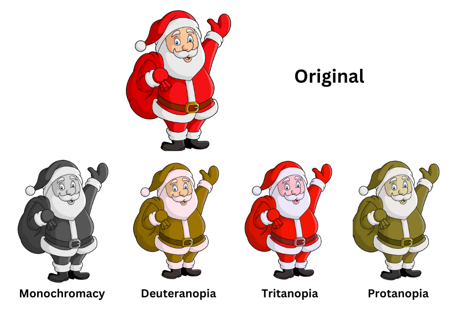
Types of colour blindness.
There are seven official diagnoses of colour blindness: four different types of color blindness fall in the red-green category, two are in the blue-yellow spectrum and one version describes a type of vision completely lacking color. These are:
- protanopia (red-blind)
- protanomaly (red-weak) – individuals usually see some shades of red
- deuteranopia (green-blind).
- deuteranomaly (green-weak) – Individuals can usually see some shades of green
- tritanopia (blue-blind)
- tritanomaly (blue-weak) – Individuals can usually see some shades of blue
- monochromacy (achromatopsia) - people cannot see any colour at all
- there is also a condition called tetrachromacy which affects some women, this is also known as 'super colour vision' and allows them to see 100 times more colour than the rest of the population
- Text: At least a 4.5:1 contrast ratio for normal text and a 3:1 ratio for large text (18px and above or 14px bold).
- UI Components: Interactive elements such as buttons and links should have a contrast ratio of 3:1 against their background.
- use dark text on light backgrounds as this combination generally offers better contrast and readability.
- avoid using colour alone to convey information, for example, if you're using red to indicate an error, make sure you also provide a clear label or icon so it’s understandable for users with colour blindness.
- test across devices and ensure your colour choices look good on different screen types.
- test by adjusting the colours to higher contrast on your device or browser and also test using Windows high contrast mode
- WebAIM Colour contrast checker: An easy-to-use tool that lets you check the contrast ratio between foreground and background colours.
- TPGI Color contrast checker: A desktop tool that can analyse any area of your screen and give you contrast ratio for text and visual elements
- If you are using Microsoft PowerPoint to create presentations, you can also use the 'inspect without color' feature in the accessibility assistant to check your content is accessible to all

Image generated by Colblindor colour blindness generator to show an image of Santa as it may appear to people with protanopia, deuteranopia, tritanopia and monochromacy.
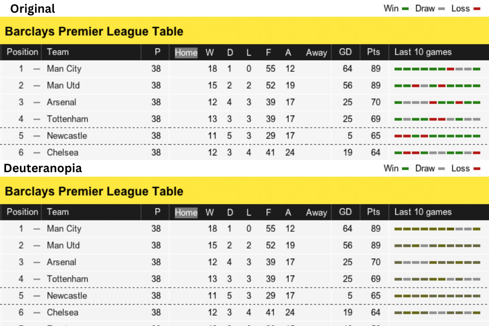
In 2012, accessibility improvements were made to the BBC football league tables where win, lose and draw were shown using red, green and grey coloured lines. The improvements added letters for win (W), lose (L) and draw (D) so that the infomation did not rely on colour alone to be percieved.

Old league tables where color alone is used to show the scores

The Scottish league tables with accessibility improvements
How to ensure good colour contrast
The Web Content Accessibility Guidelines (WCAG) recommend the following contrast ratios:
Here are a few tips to improve the contrast on your site:
Testing colour contrast
There are also browser extensions and tools that help you visualise your site’s contrast and ensure compliance with accessibility guidelines such as:
How to check colour contrast for accessibility
Watch the video from WebAIM to find out how to check colour contrast for accessibility