Day 6: Creating accessible Word documents
Word documents are a common format for sharing information, ensuring they are accessible is crucial for making your content available to everyone, including people with disabilities who may rely on assistive technologies such as screen readers or magnifiers to navigate.
Today, Accessible Document Specialist, Samantha Merrett, share's her top tips for creating accessible Word documents.
You can also sign up to join the cross government accessible documents community of practice, to find out more.
10 tips for creating accessible Word documents
1. Use structured headings
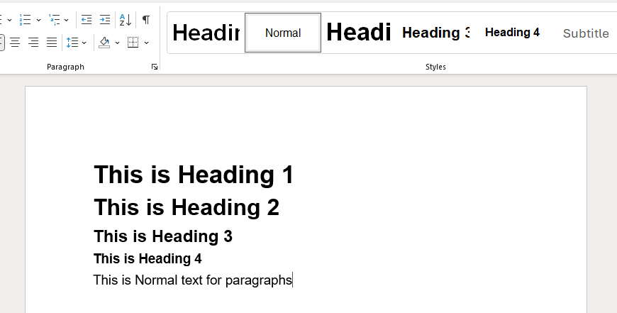
Use the built-in heading styles in the styles pane in Word to structure your document. This helps screen readers navigate the content more easily and helps you to create an interactive table of contents. Ensure that headings are used in a logical order, starting with Heading 1 for main sections and using Heading 2, Heading 3 for subsections. Rather than pressing the enter key to create spacing, use the line spacing options instead so the spaces aren't read out as 'blank'

2. Add alternative text to images
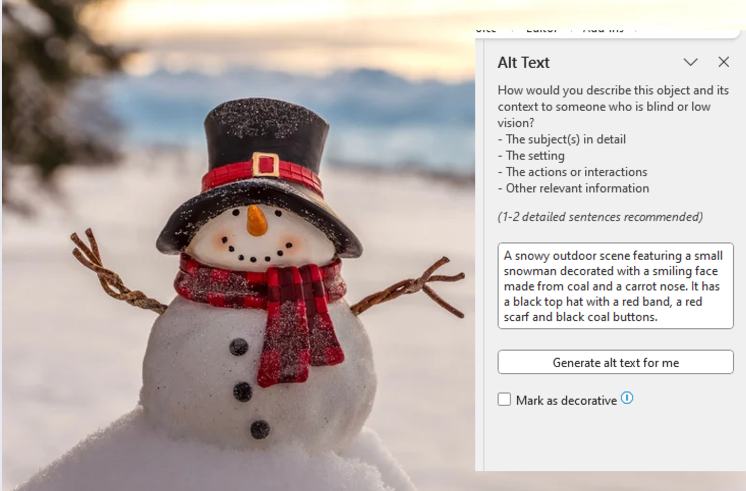
Always add alternative text (alt text) to images, charts, and other visual elements. This allows screen readers to describe the content of the images to users who cannot see them. To add alt text, right-click on the image, select "edit alt text," and provide a brief description.

3. Write descriptive links
Instead of using generic phrases like "click here," use descriptive text for hyperlinks that indicates the destination or purpose of the link. For example, "Read our accessibility guidelines" is more informative than "click here".
4. Ensure color contrast is sufficient
Make sure there is enough contrast between the text and the background colour. This helps people with visual impairments read the content more easily. You can use online tools such as the WebAIM Colour Contrast Checker to check your contrast ratios.
5. Use accessible fonts
Choose fonts that are easy to read, such as Arial, Calibri, Helvetica and Verdana. Ensure that the font size is at least 12 points but consider using 14 points for better readability.
6. Use accessible tables
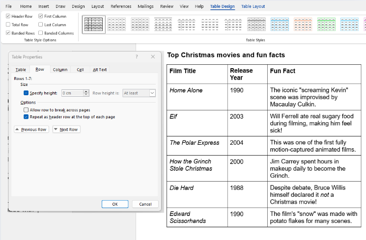
When using tables, keep them simple and avoid merging or splitting cells. Use table headers to identify column headings, ensure that the table is structured logically and set the title in the alt text settings. This helps screen readers interpret the table correctly and make the document easier to navigate with speech recognition.

7. Check accessibility with the built-in assistant
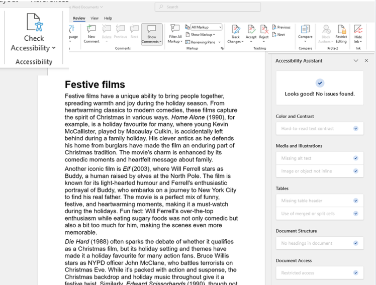
Word has a built-in Accessibility Assistant that can help you identify and fix accessibility issues. To use it, go to the "Review" tab and select "Check Accessibility." The tool will provide a list of issues and suggestions for how to resolve them.

8. Use lists for organisation
Use bulleted or numbered lists to organise information clearly. This helps screen readers convey the structure of the content to users.
9. Avoid using watermarks
Watermarks can be difficult for screen readers to interpret and may obscure the readability of the text. If you must use a watermark, ensure that it does not interfere with the document's accessibility.
10. Avoid putting important information into headers and footers
Headers and Footers are not accessible to screen readers so avoid putting important information into them. Place the content in the body content of the page instead.
By following these tips, you can create Word documents that are accessible to a wider audience, ensuring that everyone can read and understand your content. Next time you create a Word document, ask yourself:
- have I used heading styles to structure my document?
- does every image have meaningful alt text?
- is the text readable with sufficient color contrast?
- are my links descriptive and clear?
- have I run the accessibility checker?
Making documents accessible - Microsoft
Watch the video from Microsoft on making documents accessible using Microsoft Office accessibility features