Day 18: Accessibility adjustments in browsers and devices
Did you know that small tweaks to your browser or computer settings can make a big difference in improving accessibility? Whether it’s reducing eye strain or making text easier to read, adjustments like dark mode, high contrast mode, and custom text sizes help everyone, especially those with visual impairments.
Today, find out about some practical accessibility settings you can use to customise your experience and make the web more inclusive.

Changing settings on your device or browser
There are many different settings within browsers and devices that can be used to support accessibility, they are used by many people, not just those with disabilities. AbilityNet My Computer My Way includes some excellent guidance on how to use accessibility settings. Some of the most common adjusments include:
High contrast mode
For users with low vision, high contrast mode improves visibility by increasing the contrast between text and backgrounds. This feature is available on Windows, macOS, and even through browser extensions.
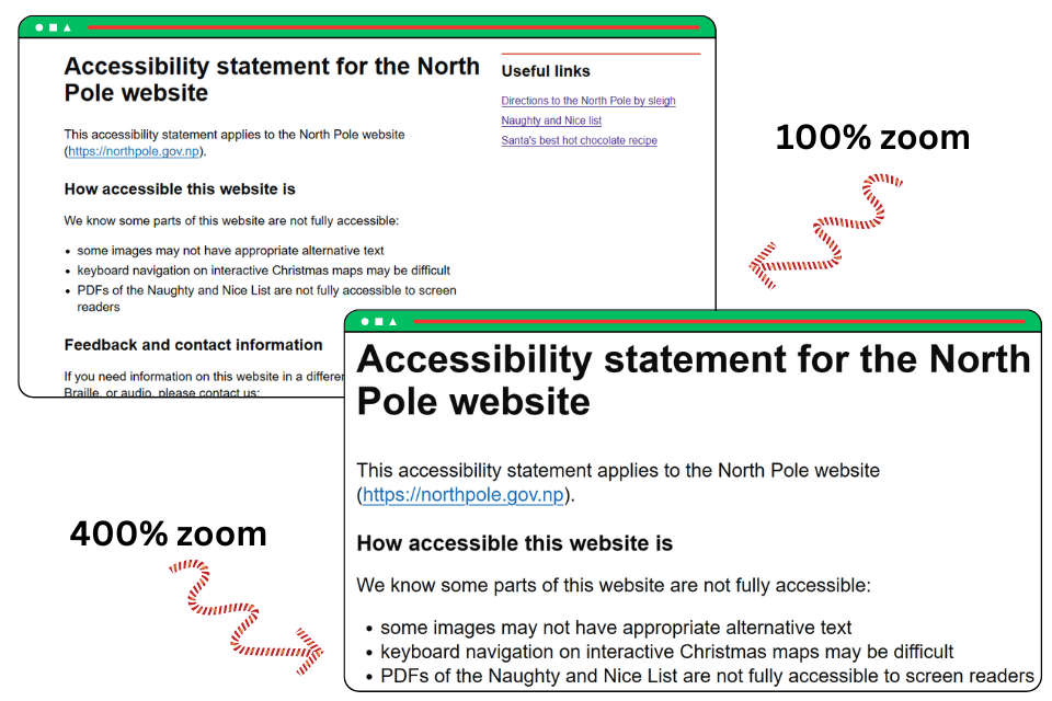
Adjusting text size and zoom levels
Struggling with small text? Use your browser’s zoom feature (`Ctrl` + `+` or `Cmd` + `+`) or adjust default font sizes in settings. This can make reading much more comfortable.

Simplified or reader view
Many browsers now include a reader view that strips out unnecessary clutter, making it easier to focus on the content. Use this feature for distraction-free reading and adjust the font size or background colour to suit your preferences.
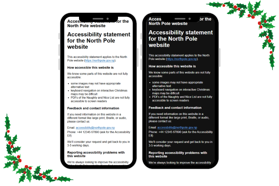
Dark mode and light mode
Switching to dark mode can reduce glare and make it easier to focus, especially in dimly lit environments. Most browsers and devices now allow you to follow your system's appearance settings or manually toggle between light and dark modes.
Customising settings for your needs
Explore your device's accessibility settings to enable features like text-to-speech, keyboard navigation, or custom colour filters (including physical filters that sit over the screen). These adjustments help users with specific needs navigate digital content more effectively. To access these settings:
- Windows: use "Windows Key + U" to enter the Ease of Access Centre
- Mac: use "Option-Command-F5" or if your Mac has Touch ID, quickly press Touch ID three times .
Accessibility overlays
Some websites use accessibility overlays, these are tools that modify the presentation of a website. While they can be helpful for some people, they should not be used as an alternative to having website that has been built with accessibility in mind and is coded to the proper accessibility standards. They are not recommended and should not be used.
Accessibility settings aren't just for those with disabilities – they improve usability for everyone. Take a few minutes today to try these adjustments and make your online experience more comfortable and accessible and if you create websites, apps or online services, make sure you test them using these adjustments.
Microsoft accessibility features
Watch the video from Microsoft Enable on using Microsoft accessibility features.
Dark or light mode: Sara Joy’s experience
Front end developer Sara Joy shares her experience with dark and light modes for accessibility.
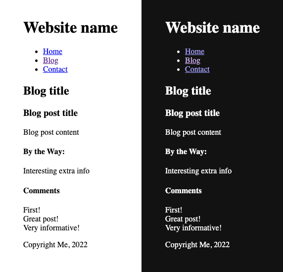
Is dark or light mode more accessible?
The first computers were dark mode by default, just text on an otherwise black CRT screen. Once we figured out graphical user interfaces, we put concerted effort into making our computer desktops white like paper, with black text. Was there a good reason for this? There are indeed perfectly good reasons for both dark and light modes being preferred by different people! Neither is the correct one.

Preferences and needs
Why some prefer dark mode:
- pupils constrict when the screen is bright, which can be uncomfortable.
- when in a dark place, a bright screen can have an uncomfortable contrast with your surroundings.
- some people have floaters in their vision, or other visual impairments like cataracts, which are exacerbated by bright environments.
Why some prefer light mode:
- pupils constrict when the screen is bright! But this is also helpful - like with a small camera aperture, a smaller pupil helps more of the image stay sharp on the retina.
- hence, focusing is easier with a brighter screen.
- people with astigmatism can have real problems with glare emanating from white text on black backgrounds.

Please, I must pick one!
If you're really looking for a default to start with, then arguably light mode is a slightly safer bet - as it has been default for a long time, and people can pull down the brightness of a display.
Allow choice
The true accessible path here is allowing choice. A switch to dark and light modes within a page, as well as following the operating system's current setting as the initial mode is a great start.
Automated choice
Thankfully this is much easier now than it used to be in modern Cascading Style Sheets (CSS). The property color-scheme does a lot of this for you in the base HTML before you even add any themes!
<head>
  <meta name="color-scheme" content="light dark">
</head>

<!-- In CSS: -->
:root /* or html */ {
  color-scheme: light dark;
}
Manual choice
There are many ways to accomplish this - but essentially you'll be using JavaScript to change the value of color-scheme between light dark, light, and dark.